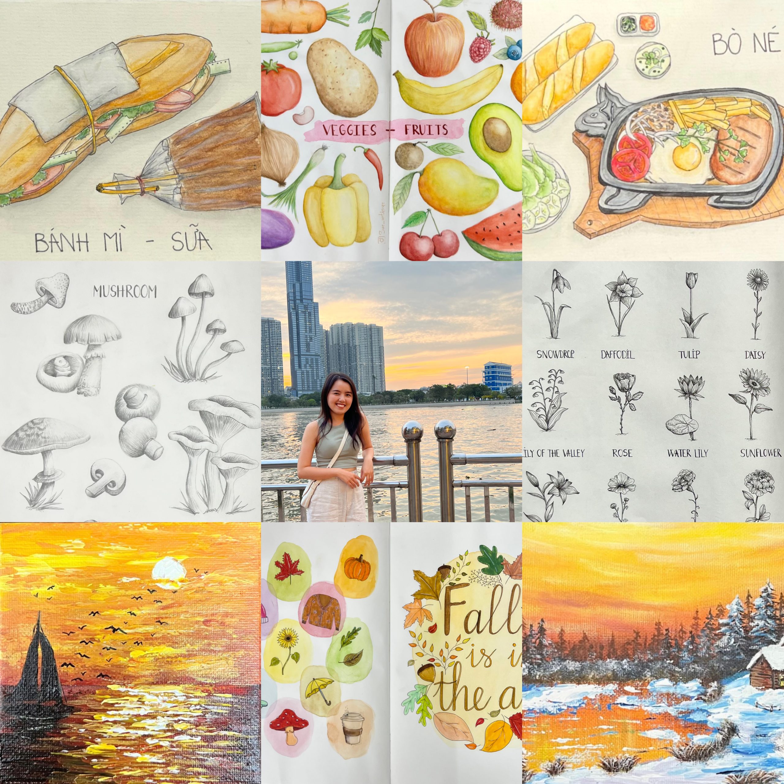
My Brand Guide:
My Brand Guide explains the values, mission, vision, personality, and voice behind Sue Art Home.
My Style Tile & Mood Board:
My Style Tile and Mood Board show the visual direction of Sue Art Home, including my colors, typography, imagery, and overall mood.
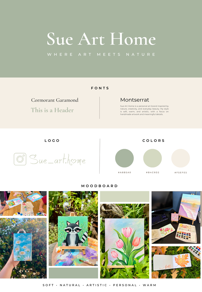
Creating my Sue Art Home brand helped me understand what makes my artwork feel personal and unique. Through the workbook, I chose four values that represent my creative process: Curiosity, Harmony, Sincerity, and Care. My tagline, “Where Art Meets Nature”, reflects my love of creating art inspired by nature and everyday beauty. I wanted the brand to feel personal, peaceful, and connected to the things that inspire me.
For my visual style, I chose soft, natural colors such as sage green, light olive green, and warm cream. I used Cormorant Garamond for an elegant artistic feeling and Montserrat for a clean, modern look. My mood board uses my own artwork and creative photos to show the soft, natural, and personal feeling of Sue Art Home. These choices will guide the colors, fonts, images, and overall design of my final website.
